Actionable elder abuse awareness

Making early warning signs clear and actionable

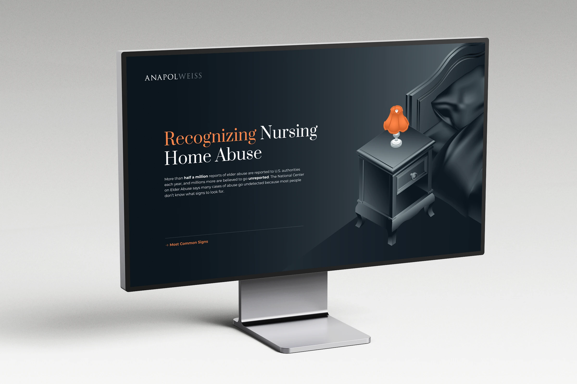
Visual overview of a legal infographic project explaining elder abuse and its key components

Category:

Informational Guide

Service:

Visual Storytelling


Industry:

Legal Services

Audience:

Families & Caregivers

Client

Anapol Weiss is a nationally recognized plaintiff law firm based in Philadelphia. The firm represents victims of personal injury, medical malpractice, and mass torts with a strong commitment to justice and public safety.

Challenges

Context

Many potential clients and their families struggle to recognize early warning signs or understand that legal support may be an option, leading to delayed intervention.

Initial Limitations

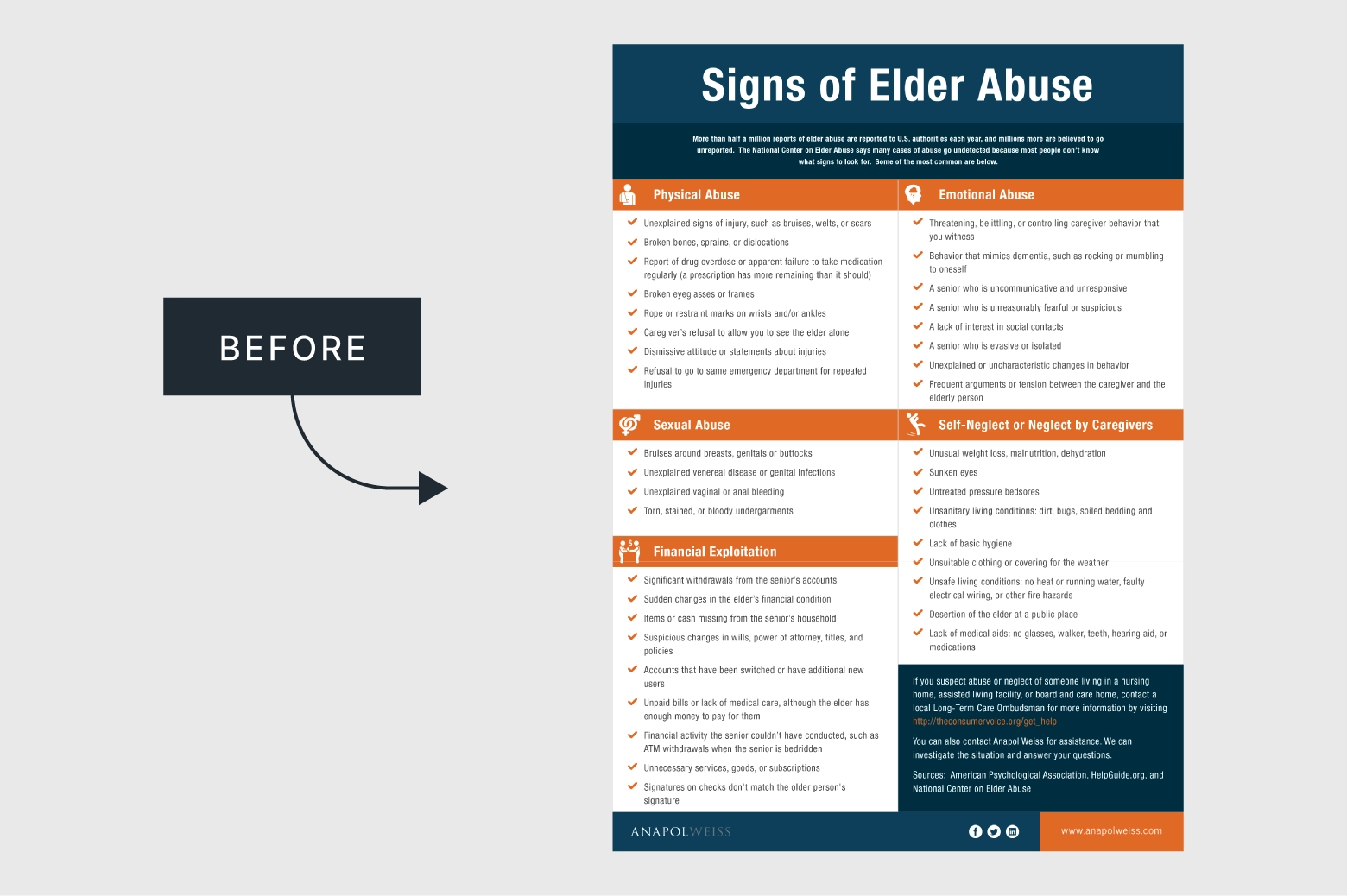
Anapol Weiss already had a previous version of the material, but it presented all information tightly packed on a single page, without a clear visual flow, an issue amplified on mobile devices, where most readers were expected to view it. The icons used did not reflect the firm’s brand or the sensitivity of the topic, and their generic appearance failed to support quick comprehension. In addition, the checklist style layout implied that multiple signs had to be present to confirm abuse, while the typography and overall identity were not fully aligned with the firm’s visual standards.

Unstructured information about elder abuse shown before being organized into a clear visual format

Project Goals

Creating engagement with highly sensitive and potentially distressing content meant achieving a careful balance, keeping the tone informative and neutral while maintaining enough empathy to build awareness.

Approach

Content Strategy

The content was reorganized into nine sections to improve clarity and reading flow. Elements of visual storytelling were introduced, such as a sense of introduction, tension, and resolution, to guide the viewer naturally through the information. Internal links were added for easier navigation between sections, and both mobile and desktop versions were designed for accessibility across devices.

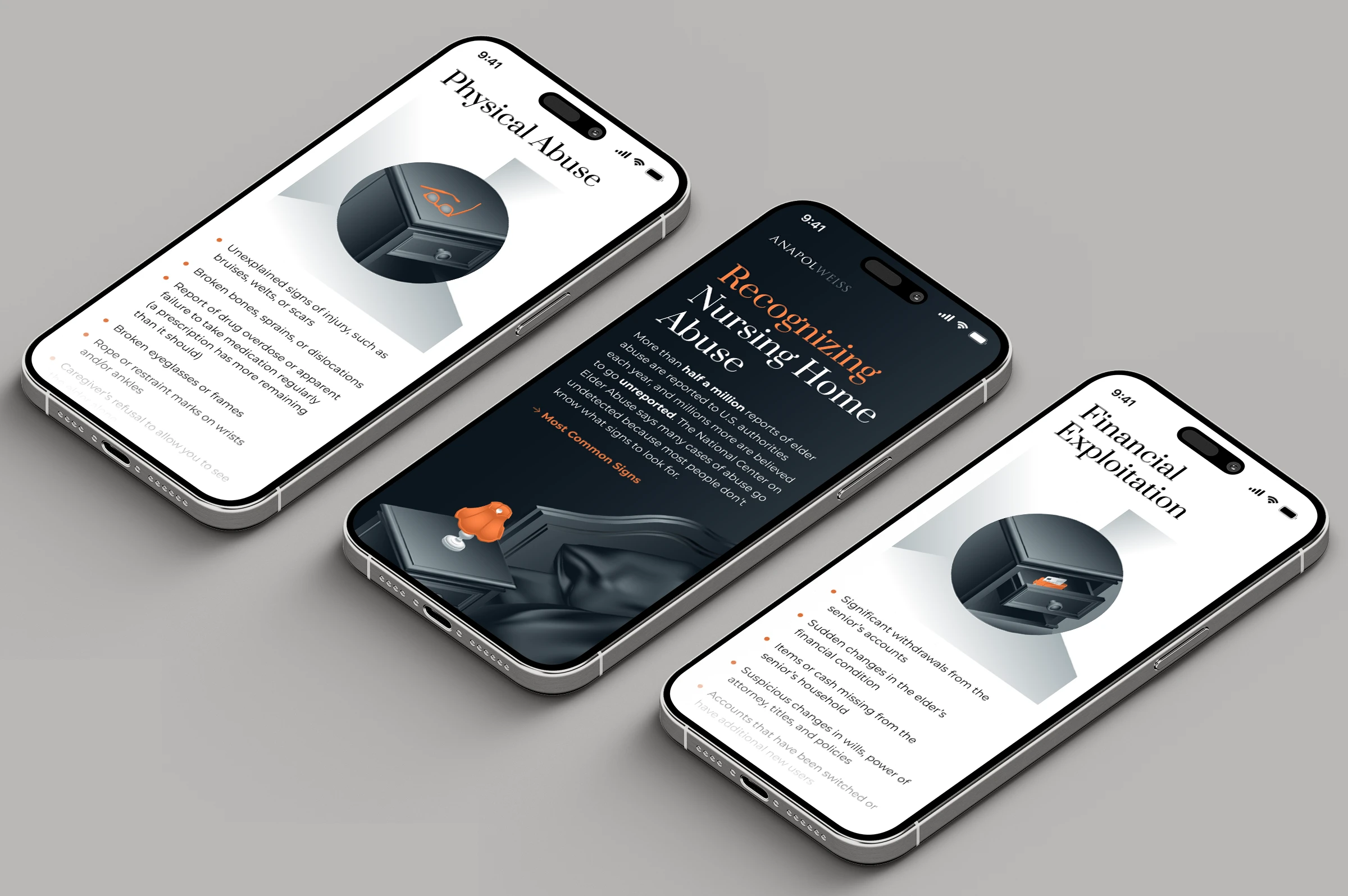
Visual representation of structuring elder abuse information into clear and organized sections

Visual Language

Illustrations replaced icons to create stronger visual engagement and a more empathetic tone. A system of visual metaphors was developed, centered around a bedside table, a personal and intimate object within an institutional environment, symbolizing presence, memory, and connection during visits from loved ones. The illustrations adopted subtle vintage elements to distinguish the atmosphere from a clinical or hospital like setting. An isometric perspective combined with soft gradients helped balance the material’s informative purpose with emotional depth, aligning naturally with the firm’s established visual style.

Impact

Clarity

The restructured layout and visual storytelling made the signs of elder abuse easier to recognize and understand, helping families and caregivers engage with complex and emotionally heavy information without distress.

Sensitivity

Replacing generic icons with metaphorical illustrations introduced warmth and visual subtlety while maintaining a neutral tone, allowing the material to address a traumatic subject with dignity and care.

Accessibility

Designing both desktop and mobile versions ensured accessibility across devices, while navigation links and a slide-based flow increased user interaction and sustained attention throughout the content.

Structured infographic presenting types and warning signs of elder abuse in a clear visual format
Final visual design of elder abuse information displayed in a clear and accessible digital format
Structured elder abuse information translated into a clean and accessible visual format for end users