Clear insight into retirement outcomes

Refining complex market analysis into accessible investor guidance
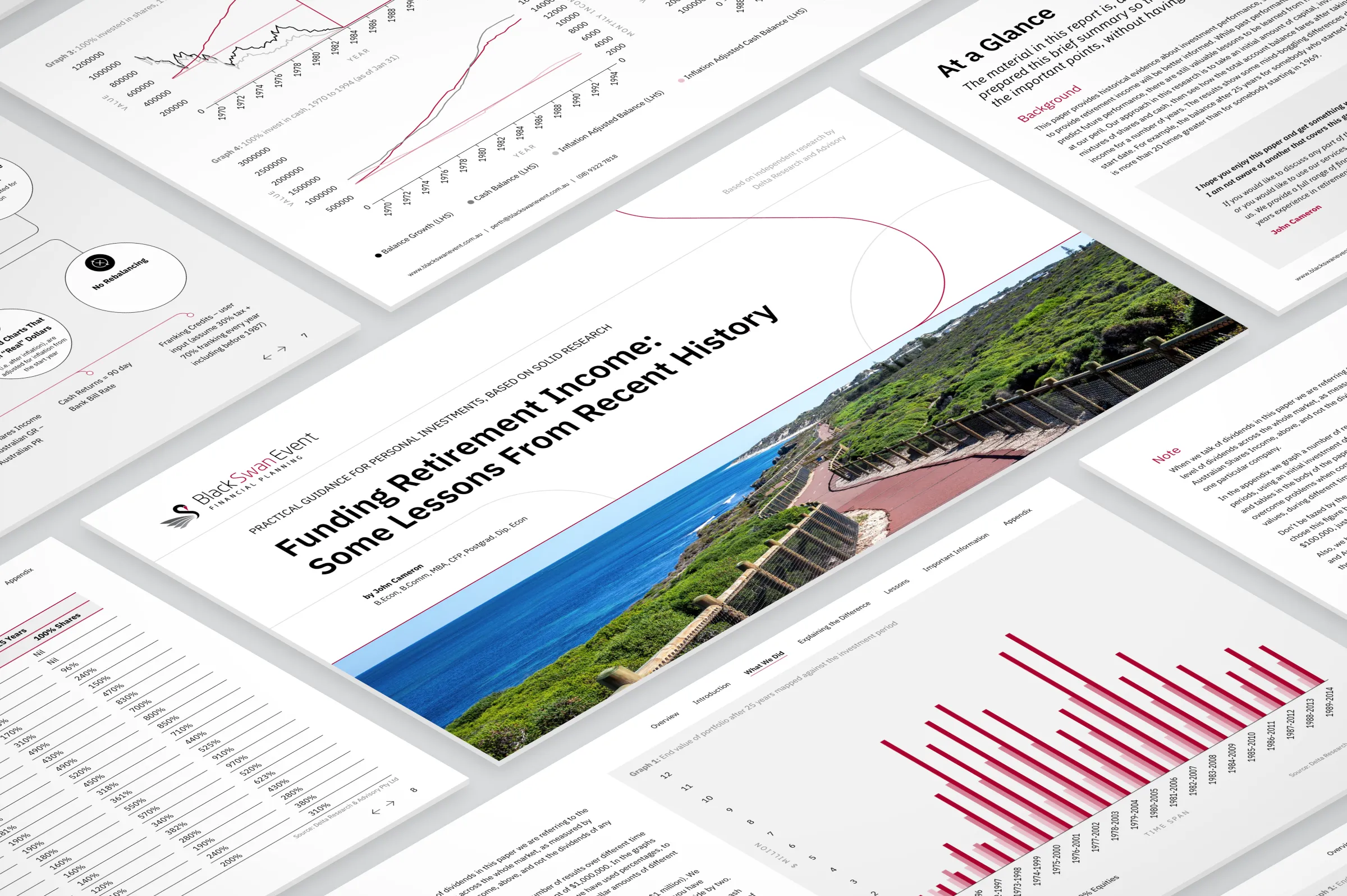
Visual overview of a financial report presenting retirement income scenarios and outcomes

Category:

Research Report

Service:

Data Visualization

Industry:

Financial Advisory

Audience:

Retirement Investors

Client

Black Swan Event is an Australian financial advisory firm providing guidance across superannuation, retirement income planning, investment strategy, and personal financial risk management. The company supports individual investors by helping them make informed, long-term financial decisions.

Challenges

Context

Individual investors often struggle to interpret long-term market data and understand how shifting economic conditions affect their retirement income. Although a detailed analysis already existed, investors needed a more accessible summary to support clear, confident decision-making.

Initial Limitations

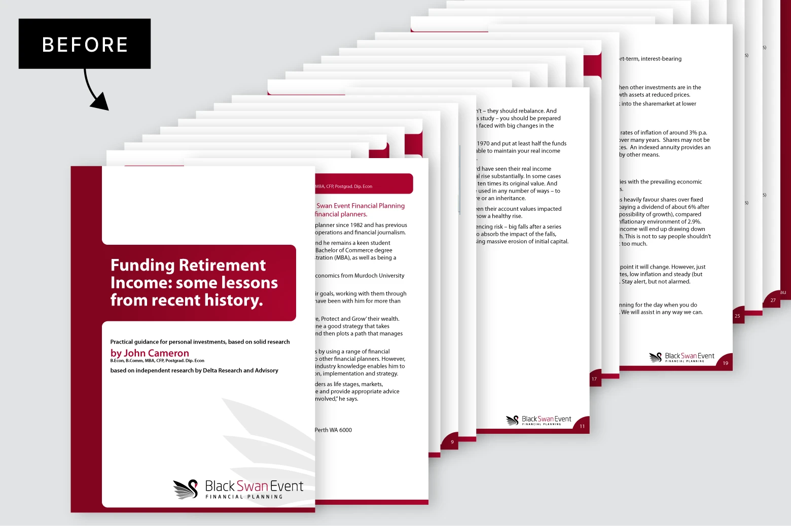
The previous version of the summary had several structural and practical limitations. It was produced in a traditional vertical format that offered little support for long time-series charts or comfortable on-screen reading, making complex data harder to interpret. The typography lacked consistency, with small text sizes that created accessibility challenges for an older audience. The visual hierarchy was weak, allowing important insights to blend into the surrounding content. Additionally, the report did not follow a coherent section structure, resulting in a fragmented reading experience. The key lessons were presented as dense text blocks without visual summarization, which made it difficult for non-expert investors to quickly extract the main ideas.

Unstructured financial report content shown before being organized into a clear visual format

Project Goals

Financial analysis needed to be presented in a format that non expert investors could absorb quickly and confidently. At the same time, the design had to strike a careful balance, modern enough to feel authoritative and current, yet conservative enough to remain familiar and reassuring for an older audience.

Approach

Content Strategy

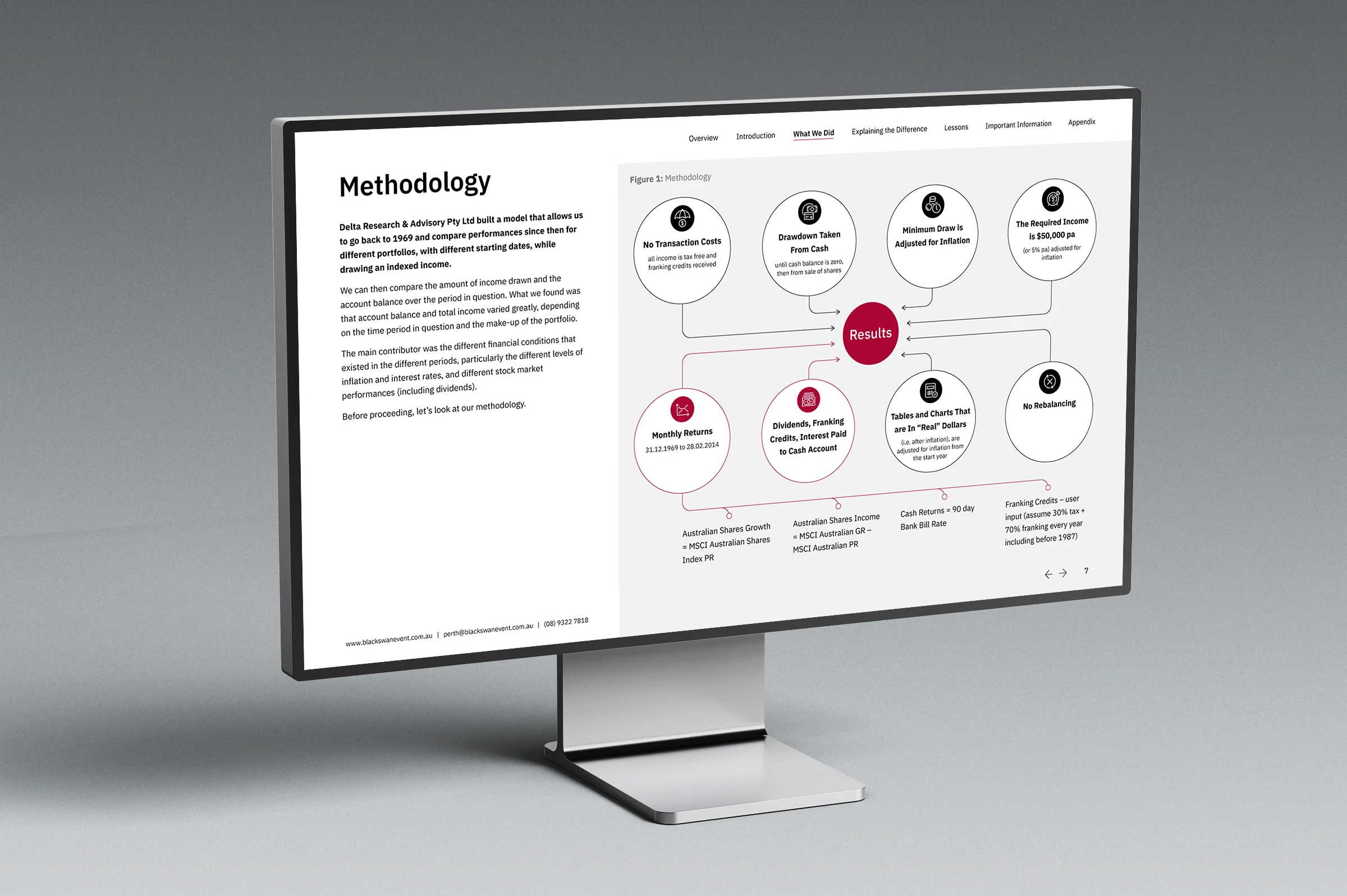
The content was carefully restructured into clear, well-defined sections with a coherent hierarchy, each introduced by its own title page. A table of contents and consistent navigational elements were added, along with distinct visual entry points to guide readers through the material. Complex information, such as the methodological notes, was transformed into infographics.

Visual process of organizing complex financial content into a structured and coherent document

Visual Language

The publication adopted a horizontal layout with a cleaner, more modern aesthetic. An improved typographic scale was introduced, featuring larger headings and increased line spacing. The use of red was applied selectively, while the broader color palette was also restricted to tonal variations of the brand’s core colors and implemented consistently across headings, tables, and graphic elements. Illustrations and iconography were defined in a linear style and integrated into a unified system. A cover photograph was added, carefully selected and refined to align with the audience and local context.

Impact

Clarity

A clearer informational structure made complex financial concepts easier to follow. The combination of defined sections, title pages, a coherent hierarchy, and consistent navigation gave readers an immediate sense of orientation. The use of infographics and supporting visuals enabled the report to communicate its key insights with greater precision and transparency.

Readability

Enhanced typographic scale and increased line spacing improved text legibility. Larger headings, clearer spacing, and a consistent column structure established a steady reading rhythm, particularly for older audiences. Visual entry points and a simplified color palette reduced cognitive load, allowing the audience to process information at a stable, uninterrupted pace.

Credibility

A refined visual system strengthened the document’s professional tone. Consistent use of brand colors, a unified iconographic style, and precise geometric layout strengthened the sense of authority in line with the financial context. The cover photograph added authenticity and grounded the material in a real-world setting. Together, these elements positioned the report as a trustworthy source of guidance for individual investors.

Structured visualization of financial methodology used to analyze retirement outcomes and scenarios
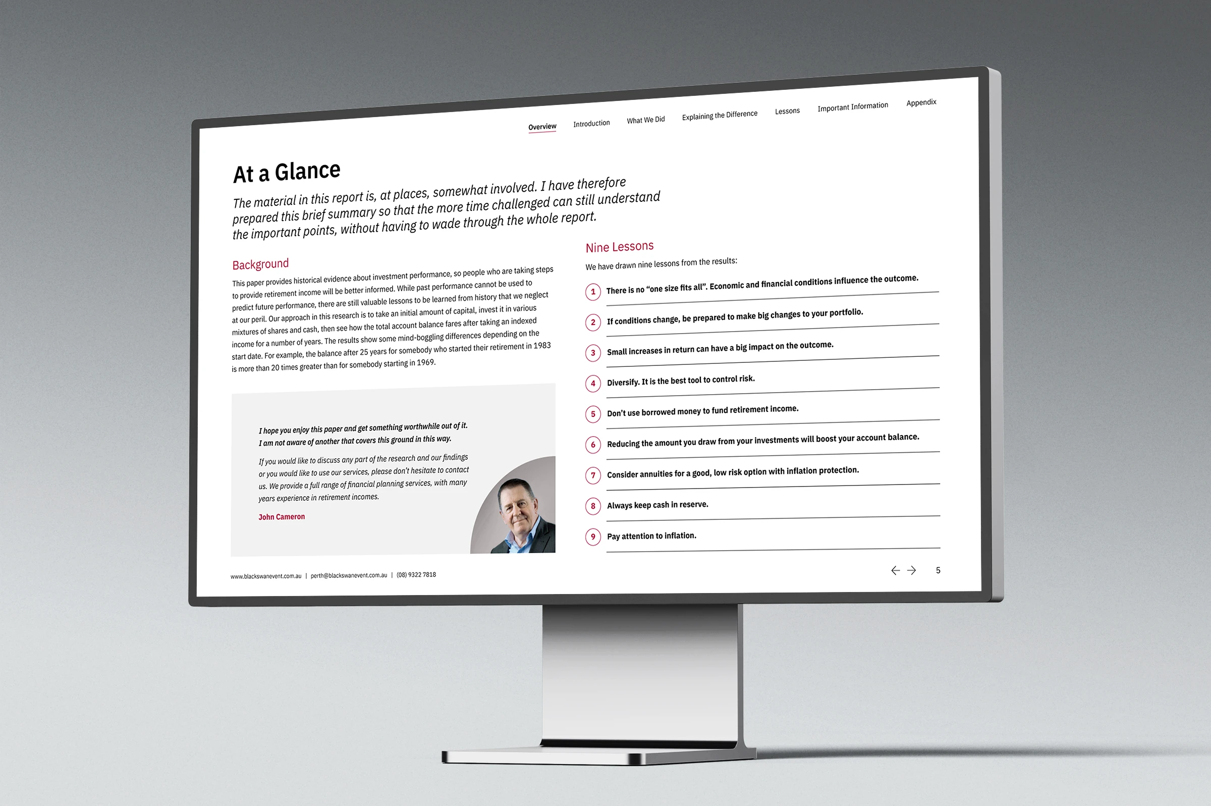
Clear visual summary of key insights and lessons related to retirement outcomes
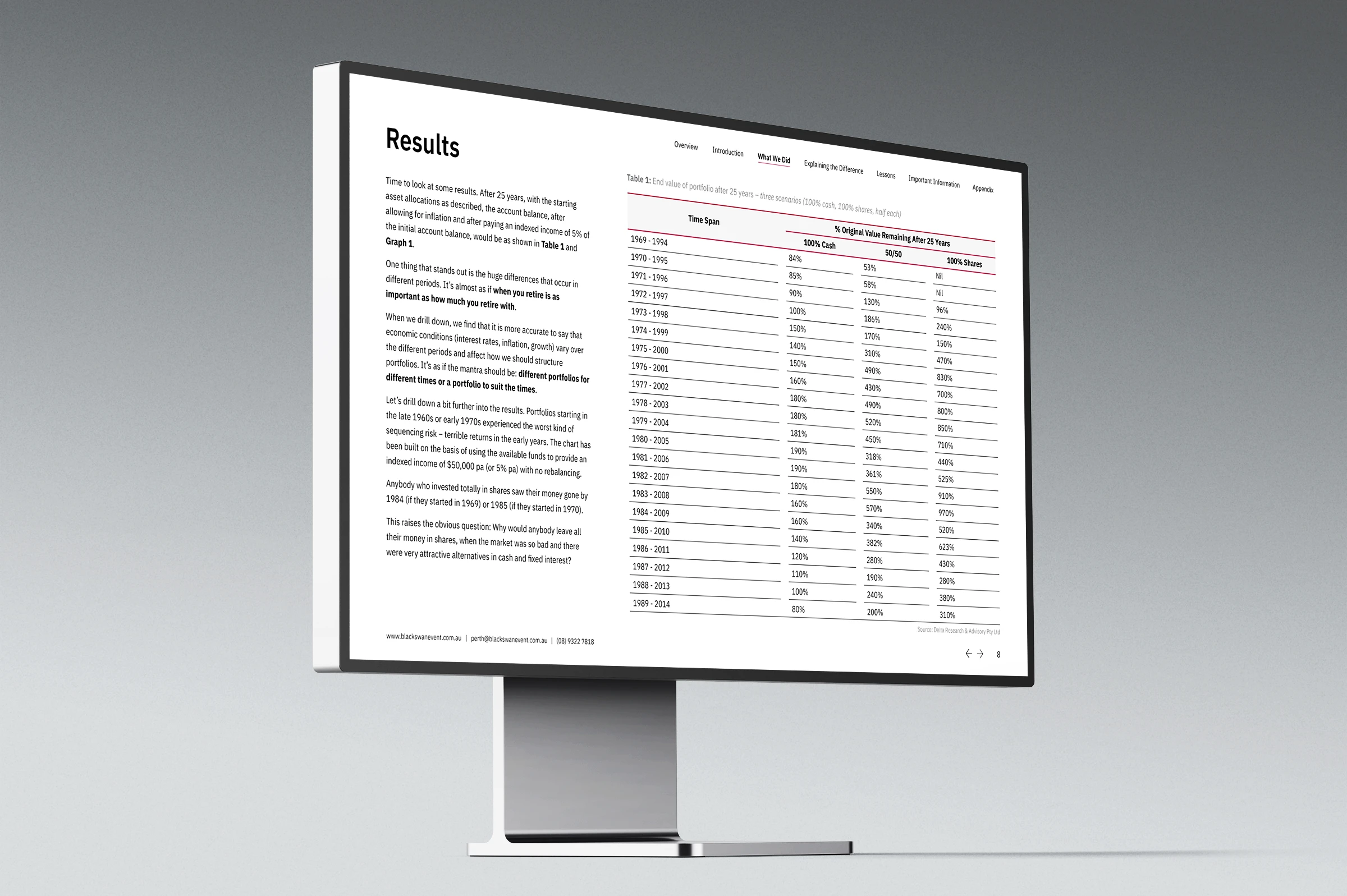
Structured presentation of retirement outcome data and financial results in a clear tabular format